Amazon WorkDocs: Unifying Enterprise Collaboration
The Challenge: Fragmented to Foundational
Amazon WorkDocs (a secure enterprise content management service) suffered from a disjointed experience across its desktop and mobile endpoints. The legacy interface wasn't just visually inconsistent; it created significant friction for users moving between devices, lacked WCAG accessibility compliance, and was rigid in the face of new feature requests.
The Strategy: A Scalable Design System
My role wasn't just to "refresh" the UI, but to architect a flexible design framework that could drive consistency across the entire product suite.
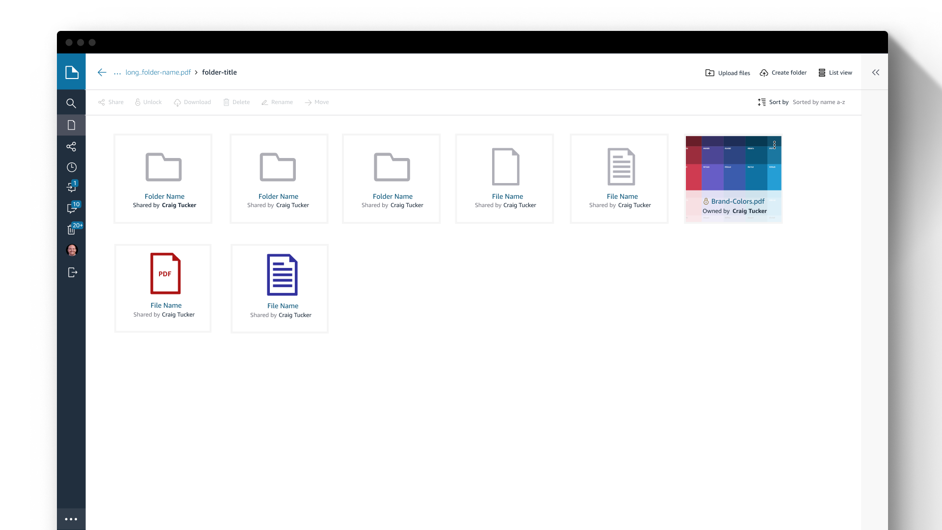
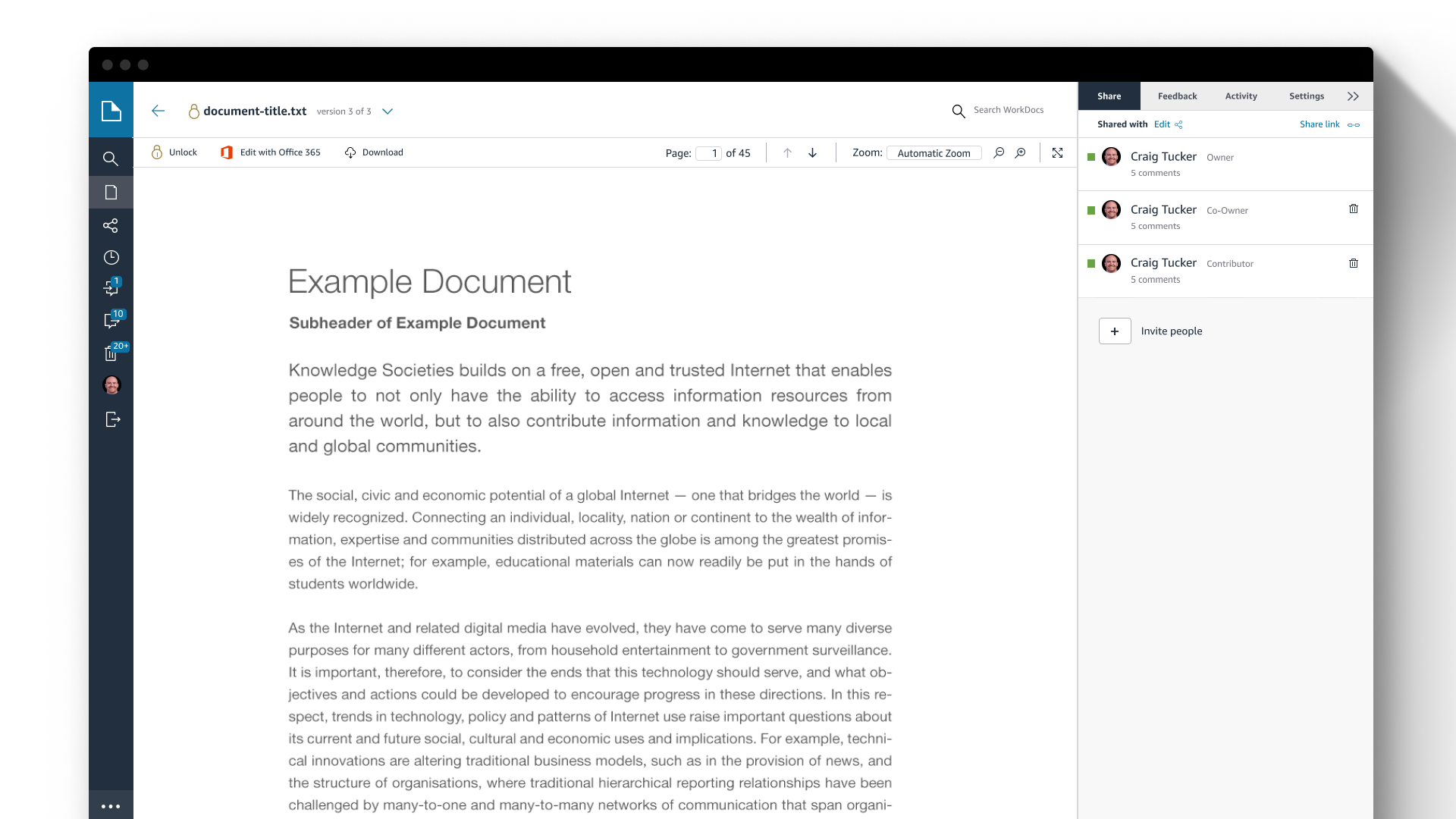
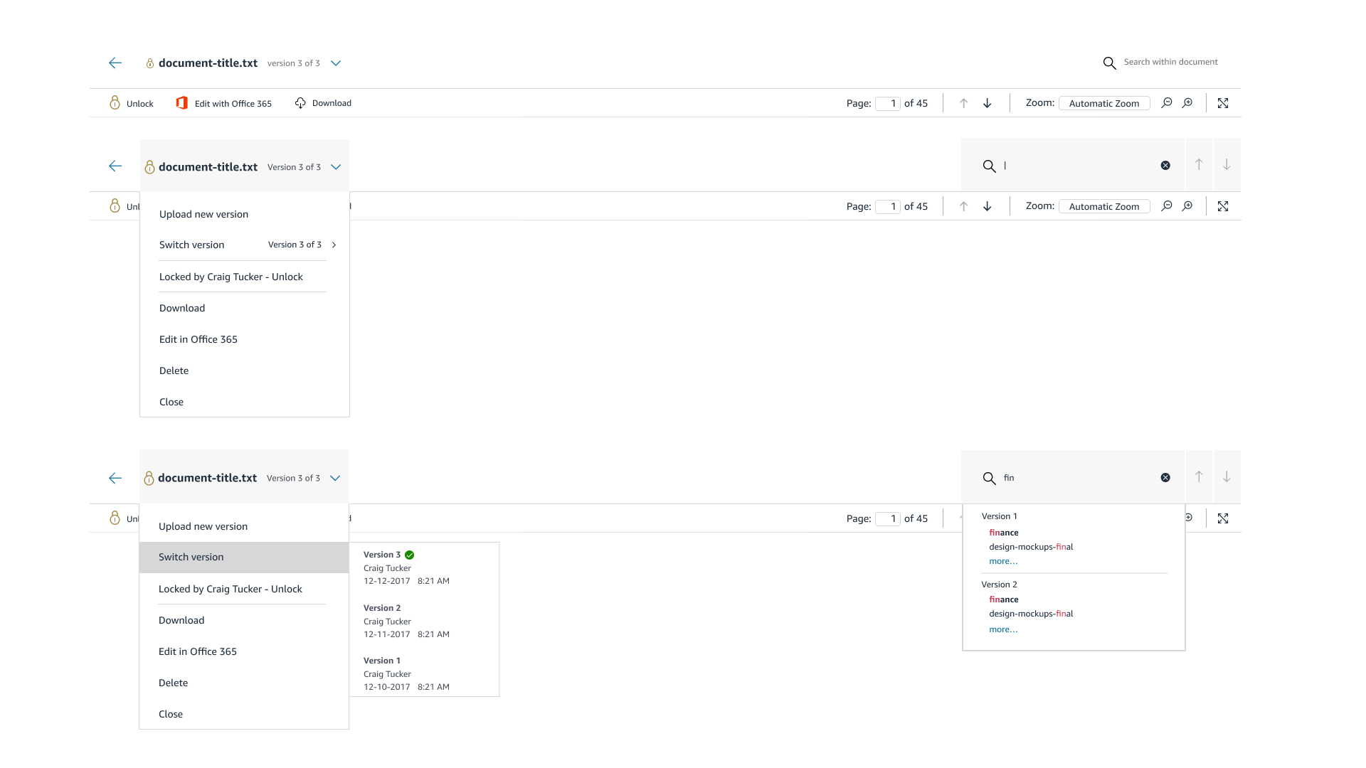
Unified Experience: I bridged the gap between desktop and mobile, ensuring that document annotation and sharing workflows felt familiar regardless of the device.
Accessibility First: I established WCAG compliance as a non-negotiable baseline, ensuring the platform was usable for all enterprise customers.
Future-Proofing: We built a modular UI system designed to absorb new features without requiring a complete redesign every time the roadmap expanded.

Phase 1: Discovery & Technical Audit
The Accessibility Debt
We began by auditing the legacy application against modern standards. The findings were stark: the existing UI failed multiple WCAG compliance checks, suffered from poor responsive behavior, and lacked a coherent visual hierarchy.
The Risk: The legacy app wasn't just "ugly"; it was a liability. It prevented enterprise customers with strict accessibility requirements from adopting the tool.
The Opportunity: We identified that the friction wasn't just visual—it was structural. Users couldn't easily take action on documents because the "Action Layer" was buried under inconsistent UI patterns.

Phase 2: Lean Systems Architecture
Establishing a Scalable UI Library
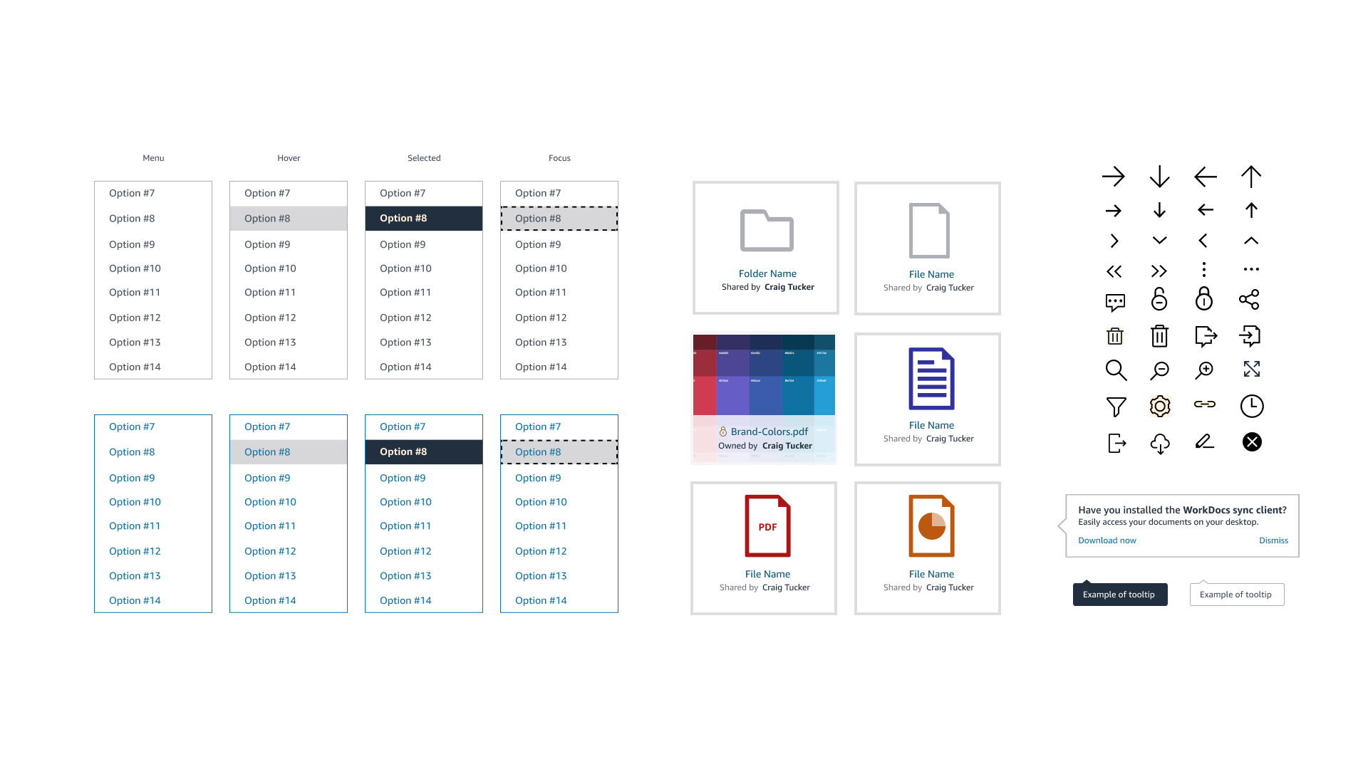
At the time, we didn't need a massive, sprawling design system; we needed consistency and speed. I established a lean, atomic library focused on small, reusable elements.
Atomic Simplicity: I defined the core "atoms"—standardized colors, typography, and iconography—that served as the building blocks for the entire platform.
Scale through Reuse: By keeping the components simple and clean, we allowed Engineering to scale the UI rapidly. They could assemble new features using these pre-validated blocks rather than writing custom CSS for every screen, which significantly reduced technical debt.
Foundation for Growth: While simple, this system was robust enough to eventually support the entire AWS Productivity Suite, proving that a clean foundation often outlasts a complex one.
Phase 3: Inclusive Design Strategy
The "Global" Stress Test
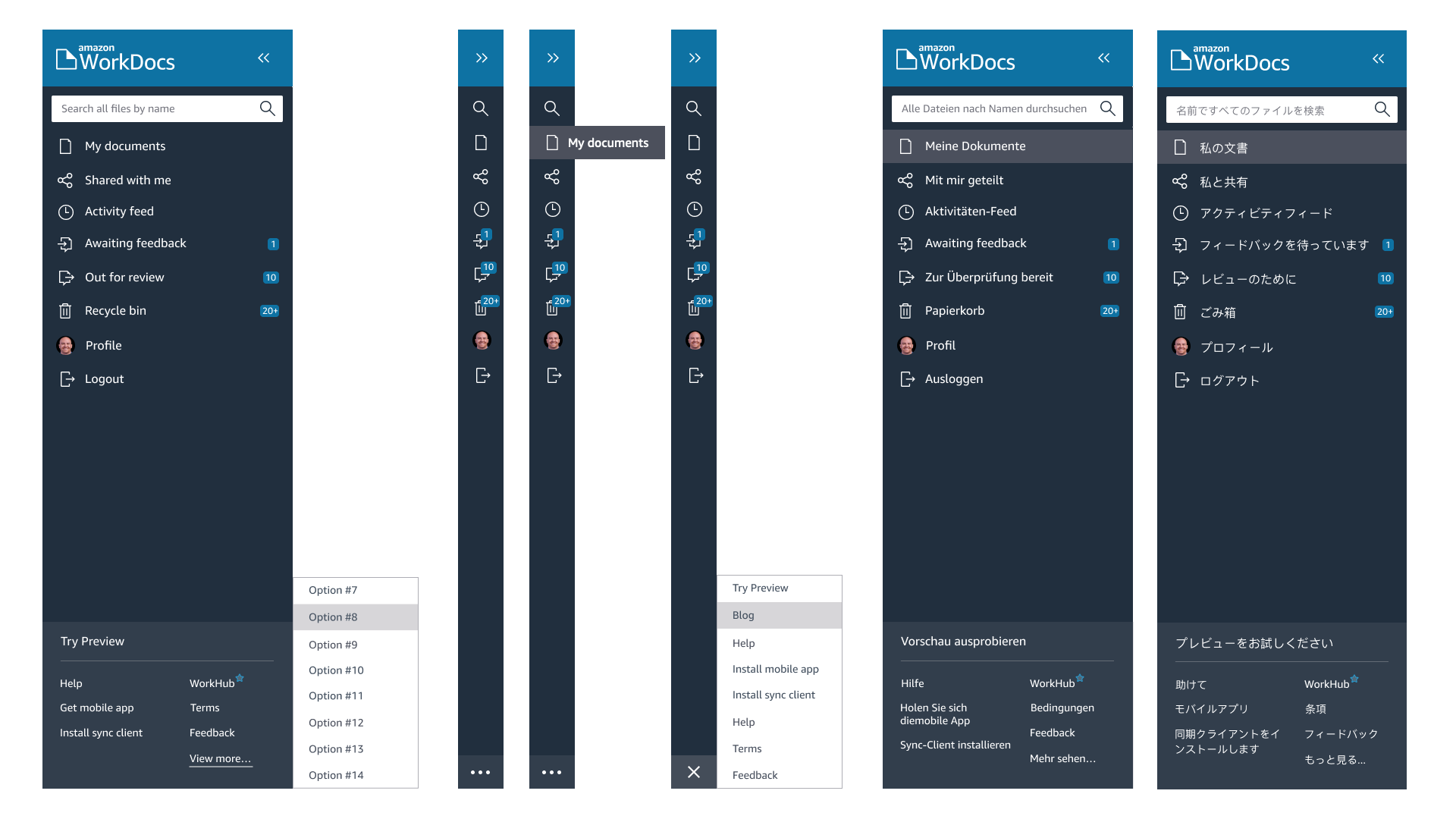
Since AWS is a worldwide platform, the UI had to survive the "German/Japanese Test."
Localization: I stress-tested components against variable text lengths. A button that works in English often breaks in German (where words can be 30% longer). I designed the atomic elements to flex dynamically, ensuring the layout preserved its integrity across languages.
Universal Accessibility: We treated accessibility as a baseline, not a feature. I redesigned navigation flows to support full keyboard tabbing and screen readers, and overhauled the color palette to meet AAA contrast standards for colorblind users.
Phase 4: The Solution
Utilitarian & Content-First
The core philosophy of the redesign was "Invisible UI." In a document collaboration tool, the interface should take a backseat to the content.
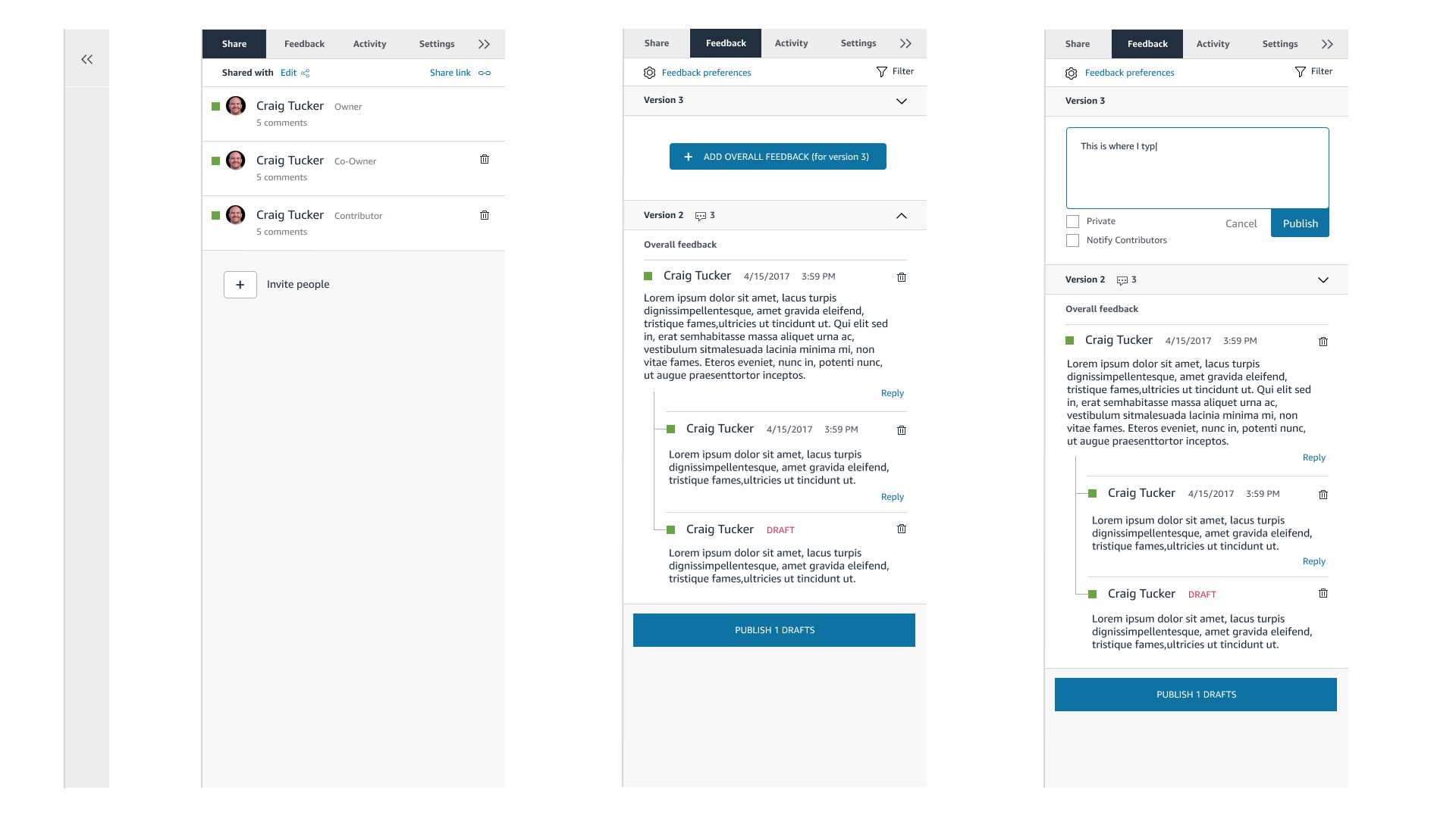
Information Hierarchy: We corrected the visual weighting of the old UI, creating a clear path for the eye. It became instantly obvious which layer was the "Document," which was the "Comment," and which was the "Reply."
Responsive Flexibility: Because the mobile app relied on web-based components wrapped in a native shell, the design needed to be fluid. I used our lean component library to ensure that tables, lists, and menus could effortlessly reflow from a desktop monitor down to a mobile screen without breaking the user's workflow.
Phase 5: Outcomes & Legacy
Operational Efficiency
The redesign delivered more than just a visual refresh; it delivered business efficiency.
Reduced Support Volume: By fixing the core usability issues and Information Hierarchy, we saw a reduction in user confusion, directly correlating to fewer "How do I?" support tickets.
The MLP Reality: We delivered a Minimum Lovable Product (MLP) that balanced immediate user value with engineering constraints. While no product is perfect at launch, the atomic framework we built meant that future iterations could happen rapidly. The app was no longer rigid; it was a living system ready for the next roadmap cycle.